Your card design is signed off, the purchase order is issued, and then the factory replies: artwork on hold. A logo sits inside the chip window. The background stops 1 mm short of the trim line. The barcode is printed over a metallic panel. Each of these is a small fix in your design file, but at the factory it means a new imposition, a new proof cycle, and a delivery date that moves by a week or more. Artwork rework — not machine capacity — is the most common reason card orders miss their promised date. This guide sets out the card artwork specifications a secure card plant actually checks, so your files clear prepress on the first submission.
Why Artwork Rework Quietly Eats Your Card Lead Time
Card manufacturing is a batch process. Sheets are printed, collated, laminated under heat and pressure, cured, punched, and only then personalized. Because lamination and punching are scheduled in blocks, a file that arrives with an artwork query does not simply lose the hours needed to fix it — it loses its slot in the next lamination batch. On a typical secure card programme that single miss is worth three to seven working days.
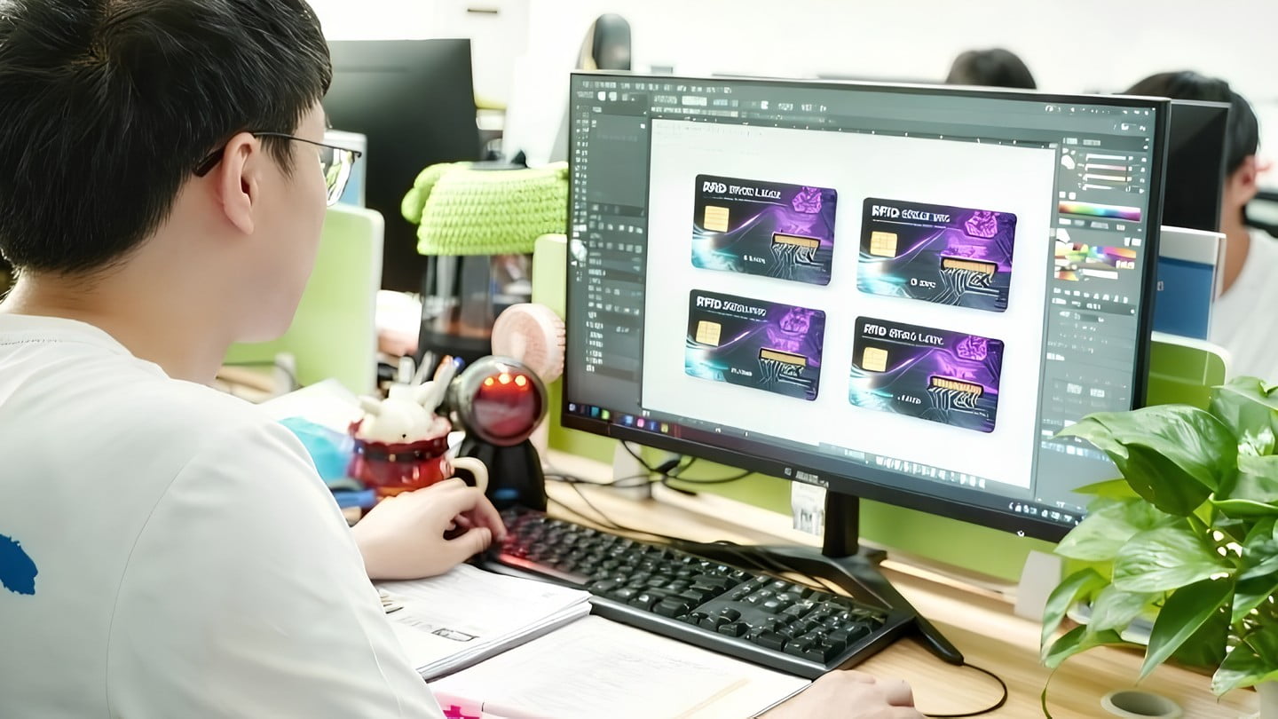
The queries are remarkably repetitive. In our prepress experience the same handful of issues account for most held jobs: no bleed, RGB images, fonts not outlined, critical content inside a keep-out zone, no space reserved for personalization, and special finishes described in an email instead of built as separate layers. None of them require design talent to prevent — they require a spec sheet and ten minutes of checking before you hit send.
There is a commercial angle too. When a factory has to redraw or rebuild your file, that work is either billed as an art charge or absorbed into a quietly padded quote. Clean, print-ready artwork is one of the few buyer-side levers that reduces both cost and lead time at the same time — which is why it belongs in your sourcing checklist next to price and MOQ, as covered in our guide to smart card project timelines.
Start With Card Geometry: ID-1 Size, Bleed, Safe Zone and Corner Radius
Every plastic card programme starts from the same physical envelope. The ID-1 format defined in ISO/IEC 7810:2019 specifies 85.60 mm × 53.98 mm with a nominal thickness of 0.76 mm, with rounded corners of roughly 3.18 mm radius. That is the finished card — not the artwork canvas.
Cards are printed many-up on large sheets and punched out afterwards. Punching has mechanical tolerance, so your background has to continue past the cut line:
- Bleed: extend all background colour and imagery 2–3 mm beyond the trim line on all four sides. With 3 mm bleed your document is 91.60 × 59.98 mm. Confirm the exact figure with your factory — it is tied to their punching tooling, not to a universal rule.
- Safe zone: keep logos, text, addresses and any element you cannot afford to lose at least 3 mm inside the trim line. Content closer than that may sit visibly off-centre once punched.
- Corner radius: do not draw the rounded corner into your artwork. The punch creates it. A drawn corner plus a punched corner produces a visible double edge.
- Borders are high risk: a thin frame running parallel to the card edge is the fastest way to expose punch tolerance. If the design must have a border, make it at least 4 mm thick so a 0.5 mm shift is invisible.
- Hole punch or slot: allow 3 mm clearance between the punch and any artwork or encoded feature.
One practical note for multi-layer secure cards: the printed core is only one layer in a laminate stack. Heat and pressure cause slight material flow, so tight registration between the front and back of a card is not achievable to the same tolerance as single-sheet offset printing. Designs that require front and back elements to line up exactly should be reviewed with the factory before approval. If you are still choosing a substrate, the trade-offs are set out in our comparison of polycarbonate vs PVC vs PETG for government ID.
Colour, Resolution, Fonts and File Format: The Rules Prepress Checks First
These are mechanical checks. An operator runs them in minutes, and any failure sends the job back to you.
- Colour mode: CMYK, not RGB. Build the document in CMYK from the start. Converting a finished RGB design at the end shifts saturated blues, greens and oranges noticeably. If brand colour accuracy is contractual, supply an ICC profile and a reference target so the plant can match to something measurable rather than to a screenshot.
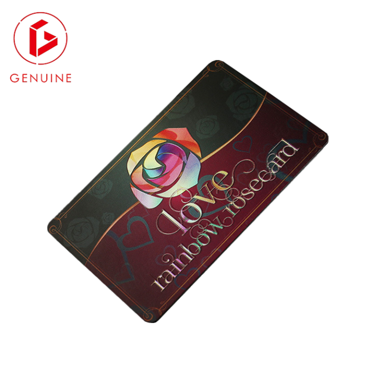
- Pantone and special inks: spot colours are available on card presses, but each spot ink is a separate plate and a separate cost. Name the Pantone reference exactly and state whether it must be printed as a spot ink or may be simulated in CMYK. Metallic, fluorescent and UV-reactive inks are always spot — they cannot be built from process colour.
- Resolution: raster images at a minimum of 300 dpi at final size. For fine security elements such as micro-text or guilloche patterns, work in vector or supply 600 dpi. Enlarging a 72 dpi web image adds no detail.
- Black text and thin rules: use 100% K rather than rich black. Four-colour black on small type shows registration fringing.
- Type size: 6 pt is a realistic floor for positive text and 7–8 pt for reversed-out text. Fine serif and script faces fill in when reversed.
- Fonts: convert all type to outlines, or package the live fonts with the file. Missing fonts are the single most common cause of an automated preflight failure.
- File format: a print-ready PDF built to a PDF/X standard is the safest deliverable, with packaged Adobe Illustrator or InDesign files (links plus fonts) as the alternative. The Ghent Workgroup publishes the widely used preflight specifications behind most PDF/X checks.
- Front and back: supply as two clearly named pages or files — front and back, both in the same orientation. “Page 2” without a label is guaranteed to trigger a query.

Keep-Out Zones: Chip Module, Antenna, Magnetic Stripe and Signature Panel
This is where secure card artwork parts company with ordinary print. A loyalty card has no keep-outs. A smart card, ID card or access credential has several, and design elements that stray into them are either destroyed in production or destroy the card’s function.
- Contact chip module. On a contact or dual-interface card the module is milled into the card body, conventionally on the upper-left of the front face, with contact geometry defined by the ISO/IEC 7816 family maintained by ISO/IEC JTC 1/SC 17. Any artwork under that footprint is milled away. Ask your factory for the exact module window for the chosen module type and treat it as a hard exclusion area.
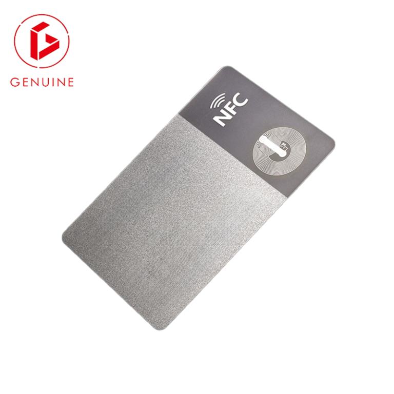
- Antenna area. Contactless cards built to ISO/IEC 14443 carry an antenna loop that runs around the inside of the card perimeter. Large areas of metallic ink, metallised foil or a metal insert placed over the antenna can detune it and cut read range or stop the card working entirely. Metallic effects on a contactless card are possible, but the position and coverage must be agreed with the factory before artwork is finalised — never assumed. Our comparison of RFID, NFC and BLE card interfaces explains which technologies are most sensitive.
- Magnetic stripe. Where a stripe is specified it occupies a band across the upper area of the card back, with position and track geometry set by the ISO/IEC 7811 series. Artwork must not run into the stripe, and nothing readable should be placed within it. Confirm the exact band with your supplier and mirror it in your template.
- Signature panel. A signature panel is an applied element, typically on the card back below the stripe. Whatever you print underneath it disappears. Reserve the panel as a blank rectangle and specify its size and position.
- Embossing zone. If characters are embossed, the raised characters distort the opposite face. Do not place a barcode, QR code, fine text or a signature panel directly behind the embossing area — the deformation will make the reverse side unreadable.
The practical rule: request the factory’s keep-out template for your exact card construction and place it as a locked top layer in your design file. A keep-out drawing supplied by the plant that will actually build the card outranks any generic template downloaded from the internet.
Reserve Space for Personalization and Variable Data
Base printing is only half the card. Photographs, names, employee numbers, barcodes and serial numbers are applied afterwards, and each personalization method has its own requirements for the surface underneath. Designs that ignore this look excellent as a flat visual and fail as a credential.
- Photo window. Reserve a clear, light, low-detail area. A busy background behind a portrait reduces facial legibility and makes visual verification harder for a guard at a door.
- Laser engraving reserve. Laser engraving in polycarbonate produces greyscale marking within the card body. It needs a light, unprinted or lightly printed area to read clearly; engraving over dense dark ink gives poor contrast.
- Thermal and re-transfer text fields. Reserve a defined block for each variable field, and state the field name, maximum character count, font and alignment. Long names that were never tested are a classic launch-day failure.
- Barcodes and QR codes. Print onto a light, matt, non-metallic background and preserve the quiet zone around the symbol. Barcodes over metallic, holographic or dark backgrounds routinely fail to scan even when they look perfect to the eye.
- Serial numbers and UID printing. If a chip UID or a sequential number is printed on the card, fix its position, font and start value in the specification — not in an email thread.
Which reserve you need depends on how the cards will be issued. Central factory personalization and desktop issuance impose different constraints, and both are covered in our guides to card personalization methods and building an ID card issuance programme.
Layers, Special Finishes and Your Pre-Flight Checklist
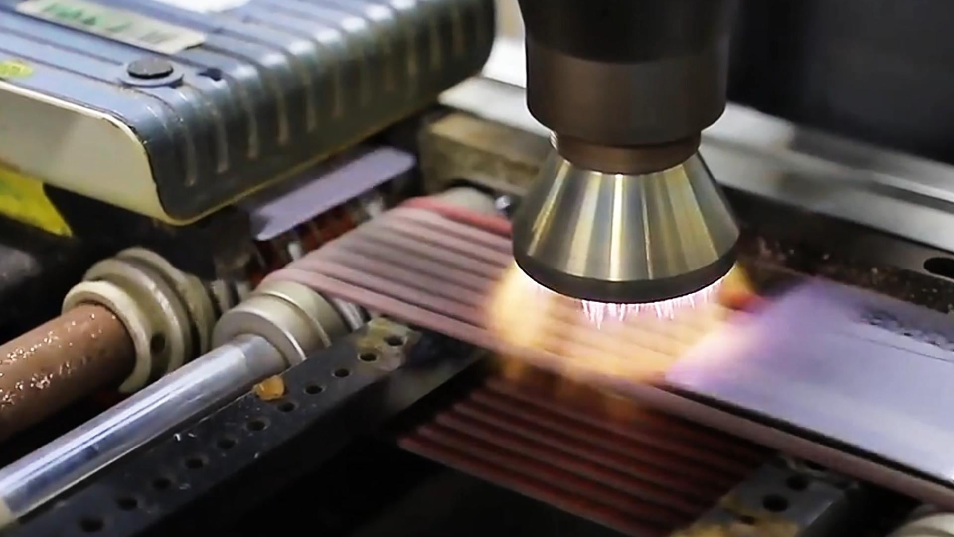
Anything that is not standard CMYK printing has to exist as its own layer, not as an instruction in the covering email. Build each special process as a separate, clearly named layer using a 100% spot colour, set to overprint, and supply a flattened visual proof alongside it so the operator can see the intended result.
- WHITE: white underprint. Mandatory on transparent, frosted, metallic and dark substrates — without it, CMYK printed straight onto a non-white card looks washed out and colour-shifted.
- FOIL / SPOT_UV / VARNISH: hot foil, spot gloss and matt varnish areas, each as its own layer with a defined minimum line weight.
- OVD / HOLOGRAM: the position of a holographic overlay or patch. Overlay application carries its own placement tolerance, so keep critical artwork clear of the patch edge rather than relying on exact registration.
- DIE / SLOT: any non-standard shape, slot or punch, drawn as a path — not as a picture of a shape.
Run this list before you send the file. It is short, and it removes most of the reasons a card factory sends artwork back:
- Document built at card size plus the bleed your factory specified; background extends fully into the bleed.
- All critical content at least 3 mm inside the trim line; no thin border hugging the edge.
- Document colour mode CMYK; Pantone references named and confirmed as spot or process.
- Raster images 300 dpi or higher at final size; security detail in vector or 600 dpi.
- All fonts outlined or packaged; minimum 6 pt positive, 7 pt reversed.
- Factory keep-out template applied: chip module, antenna, magnetic stripe, signature panel, embossing zone all clear.
- Personalization areas reserved: photo, engraving or thermal fields, barcode with quiet zone on a light matt background.
- Special finishes on separate named layers set to overprint, with a visual proof attached.
- Front and back supplied as separate, clearly labelled files in matching orientation.
- A flattened JPG or PDF proof of the intended appearance included, so any discrepancy is caught before plates are made.
One last step that pays for itself on any repeat programme: ask for a physical pre-production sample and approve it in writing as the reference standard for the contract. A signed sample turns “the colour looks different” into a measurable dispute you can actually resolve — and it gives you an objective baseline for incoming inspection on every future batch. Government and regulated identity programmes should also align the specification with the relevant guidance in ICAO Doc 9303 before artwork is locked.
Frequently Asked Questions About Card Artwork Specifications
What file format should I send to a card factory?
A print-ready PDF built to a PDF/X standard, with fonts outlined or embedded and images at final resolution. Packaged Illustrator or InDesign files with all links and fonts are equally acceptable. Flat JPG or PNG files can be used for simple full-colour designs but are unsuitable when spot colours, special finishes or die lines are involved.
How much bleed do plastic cards need?
Typically 2–3 mm on all four sides, giving a document of about 89.6 × 58.0 mm to 91.6 × 60.0 mm for a standard ID-1 card. The figure is tied to the punching tooling, so confirm it with your supplier rather than assuming an industry default.
Can I use Pantone colours on smart cards?
Yes. Spot inks are standard practice on card presses, and metallic or fluorescent effects require them. Each spot ink is an additional plate, so state clearly which colours must be spot and which may be simulated in CMYK, and expect the choice to appear in the quotation.
Will a metallic or foil finish stop my contactless card from working?
It can. Conductive metallic layers over the antenna area can detune the antenna and reduce or eliminate read range. Metallic effects on contactless cards are achievable, but the coverage and position must be reviewed by the factory against the specific inlay before artwork approval.
Do I need to supply front and back as separate files?
Yes — as separate, clearly labelled pages or files in the same orientation. Unlabelled multi-page documents are a frequent source of front-back reversal, which is only discovered after printing.
What happens if my artwork fails preflight?
The job is held and returned with a query. Correcting and resubmitting is usually quick, but the order loses its production slot, which is why an apparently minor artwork issue commonly costs several working days on the delivery date.
Get the Right Template Before You Design
The most reliable way to avoid rework is to design onto the factory’s own template for your exact card construction — substrate, chip type, stripe, panel and finish. As a manufacturer building secure cards since 2005, we supply keep-out templates and review incoming artwork before quotation so problems surface at the design stage, not after the purchase order.
Send us your card construction and we will return the matching artwork template plus a free pre-flight review of your existing design. Contact our team with your requirement, or start with our overview of custom plastic card printing solutions if you are still scoping the project.