A certificate is often the only physical object a graduate, trainee, or award winner keeps from their time with your organization. When the design looks like a template anyone could print at home, the perceived value of the qualification drops with it — and so does your brand. If you issue diplomas, training credentials, or compliance certificates in volume, innovative certificate paper design is not decoration. It is the difference between a document people frame and a document people question.
This guide walks through certificate design ideas that actually move the needle for institutions and businesses: which paper stocks signal quality, which visual techniques make a certificate stand out, and how to use security features as design elements — so the same choices that impress recipients also stop counterfeiters.
Why Certificate Design Directly Affects Perceived Value
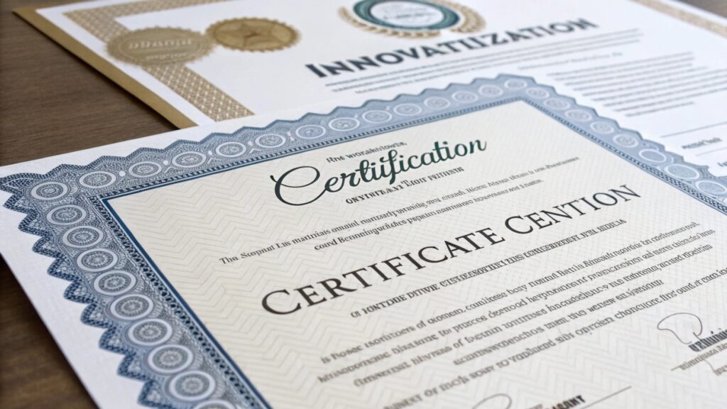
Recipients judge a credential in the first three seconds of holding it. Weight, texture, and finish register before a single word is read. That snap judgment matters commercially: universities report alumni displaying framed diplomas for decades, and training providers know a premium certificate gets photographed and shared on LinkedIn — free marketing you cannot buy.
There is a harder business reason too. Credential fraud is an industrial-scale problem — the UK’s government-backed Higher Education Degree Datacheck (HEDD) estimates hundreds of fake degree providers target UK institutions alone. A distinctive, hard-to-replicate design protects the value of every genuine certificate you have ever issued. Generic design is not just unimpressive; it is an open invitation to forgers.
Foundation First: The Paper Stock Sets the Tone
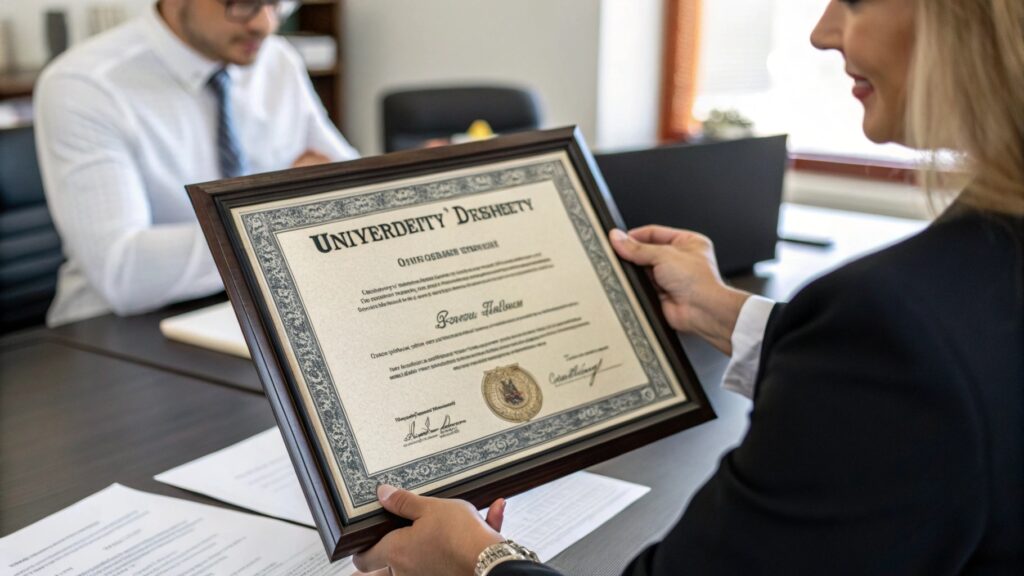
No amount of graphic design rescues a certificate printed on ordinary 80gsm office paper. Before choosing colors or fonts, decide what the document should feel like:
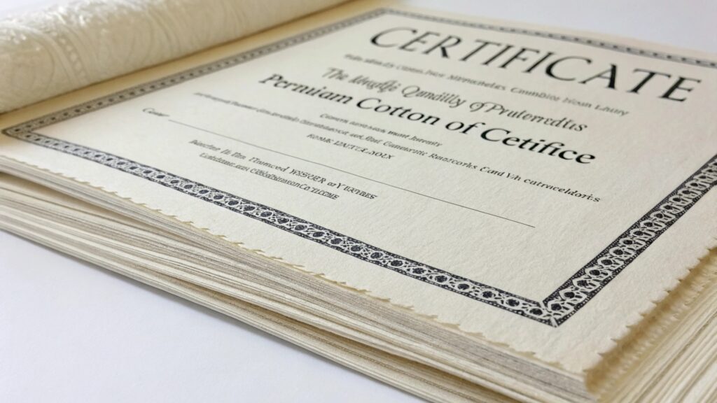
- Cotton and linen blends — a 75% cotton / 25% linen sheet has the same fiber base used in banknotes. It feels substantial, takes embossing cleanly, and lasts decades without yellowing. See our guide to custom features available for cotton and linen paper.
- Weight of 120–200gsm — heavy enough to frame flat, stiff enough to survive mailing. Most premium diplomas sit in this range.
- Finish — a laid or felt-marked texture reads as traditional and prestigious; a smooth wove finish suits modern corporate awards.
- Tone — natural white and soft ivory outperform bright white for formal documents; they photograph better and feel archival.
If you are still comparing base stocks, our guide to choosing the perfect certificate paper breaks down fiber, weight, and finish options in detail.
Five Design Ideas That Make Certificates Stand Out
Once the stock is right, these techniques deliver the most visible return per dollar of print budget:
- Engraved-style borders and guilloché patterns — the fine interlocking line work used on currency. It looks unmistakably official and is genuinely difficult to reproduce on a desktop scanner.
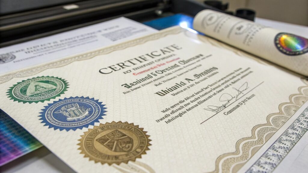
- Foil stamping and metallic seals — gold or silver foil crests catch light in a way flat printing cannot. A foil seal is the single most-noticed element on a certificate.
- Blind embossing — a raised, ink-free impression of your crest adds a tactile layer recipients instinctively run their fingers over. Subtle, premium, and forgery-resistant.
- Disciplined typography — pair one engraved serif for names and titles with one restrained sans-serif for body details. Oversized calligraphic recipient names remain the emotional centerpiece of any diploma.
- Brand-anchored color — limit the palette to your institutional colors plus one metallic. A single confident accent (a ribbon stripe, a colored deckle edge) is more memorable than a rainbow.

Security Features That Double as Design Elements
The smartest certificate programs choose features that are beautiful and verifiable. This is where innovative design pays for itself twice:
- Custom watermarks — a true fourdrinier watermark of your crest is formed in the paper itself during manufacture, not printed on it. It cannot be photocopied and instantly authenticates the sheet. Learn how they are made in our piece on the art of custom watermarked paper.
- Hologram seals and overlays — color-shifting holographic crests give instant visual verification and a distinctly modern accent.
- UV-fluorescent fibers and inks — invisible in daylight, they light up under a UV lamp, giving registrars a two-second authenticity check.
- Numbered security threads and microtext — serialization ties each certificate to your issuance records, closing the loop for employers who call to verify.
Work with printers operating under ISO 14298 (security printing management) when ordering watermarked or serialized stock — it certifies that the supplier controls production, waste, and delivery so genuine blanks never leak into the wrong hands.
From Concept to Print: Briefing Your Certificate Supplier
A strong design brief saves weeks of revision and protects your budget. Before you contact a printer, prepare:
- Brand assets — vector logo, crest, exact color references, and any typography rules.
- Volume and cadence — annual quantity and whether names are printed by the supplier or overprinted in-house (this changes the paper and coating choice).
- Security tier — decide which features are must-have (watermark, serial numbers) versus nice-to-have (foil, hologram) so quotes are comparable.
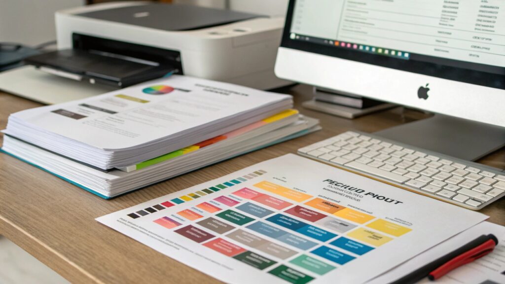
- Physical samples — always approve a printed proof on the actual stock. Screen previews cannot show texture, foil behavior, or watermark clarity.
If you are comparing vendors, our checklist for finding the best certificate supplier covers the questions that separate security printers from ordinary commercial shops.
Frequently Asked Questions
How much does custom-designed certificate paper cost?
Cost scales with security level. Digitally printed designs on premium cotton stock start at well under a dollar per sheet at volume. Adding foil and embossing typically adds a modest per-unit premium plus a one-time die charge, while true custom watermarked paper involves a mill minimum — usually practical from a few thousand sheets. Most institutions find the per-certificate cost trivial next to the reputational cost of a forged credential.
Can I combine a traditional look with modern security features?
Yes — that combination is the current best practice. A classic engraved border and calligraphic typography can sit over UV fibers, microtext, and a custom watermark without changing the visible aesthetic at all. Recipients see heritage; verifiers see technology.
What size and orientation should a certificate be?
A4 or US Letter in landscape remains the standard because it frames well and fits standard folders. Portrait formats stand out for awards and memberships. Whatever you choose, keep a clear margin of at least 15mm so framing never crops your border or seal.
How do I stop my certificate design being copied?
Layer at least one feature from each of three categories: something in the paper (watermark, UV fibers), something on the paper (foil, hologram, embossing), and something in the data (serial numbers, verification URL or QR). A forger may fake one layer convincingly, but faking all three at once is rarely economical — which is exactly the point.
Next Step: See and Feel the Options Before You Decide
Certificate design decisions are tactile decisions — no PDF can tell you how a blind-embossed crest feels or how a watermark reads against light. Request a sample pack of cotton and linen certificate stocks with watermark, foil, and hologram options, and put real sheets in front of your stakeholders. Contact our team for samples and a design consultation tailored to your certificate program.